


How to Create a Waterfall Chart in PowerPoint: Step‑by‑Step Guide
If you’ve ever needed to explain how you get from one number to another - revenue to EBITDA, budget...
If you work in project management, consulting, construction, software development, or any field where planning and tracking timelines is critical, you have likely encountered a Gantt chart. These horizontal bar charts are the go-to visualization for communicating project schedules -when tasks start, how long they take, and how they relate to each other -in a format that is immediately readable by both project teams and stakeholders.
While PowerPoint does not have a built-in Gantt chart type in its Insert Chart gallery, there are several practical ways to create one for your presentations. This guide walks you through what Gantt charts are, when you should use them, and - most importantly - how to create a Gantt chart in PowerPoint step by step, using five different methods.
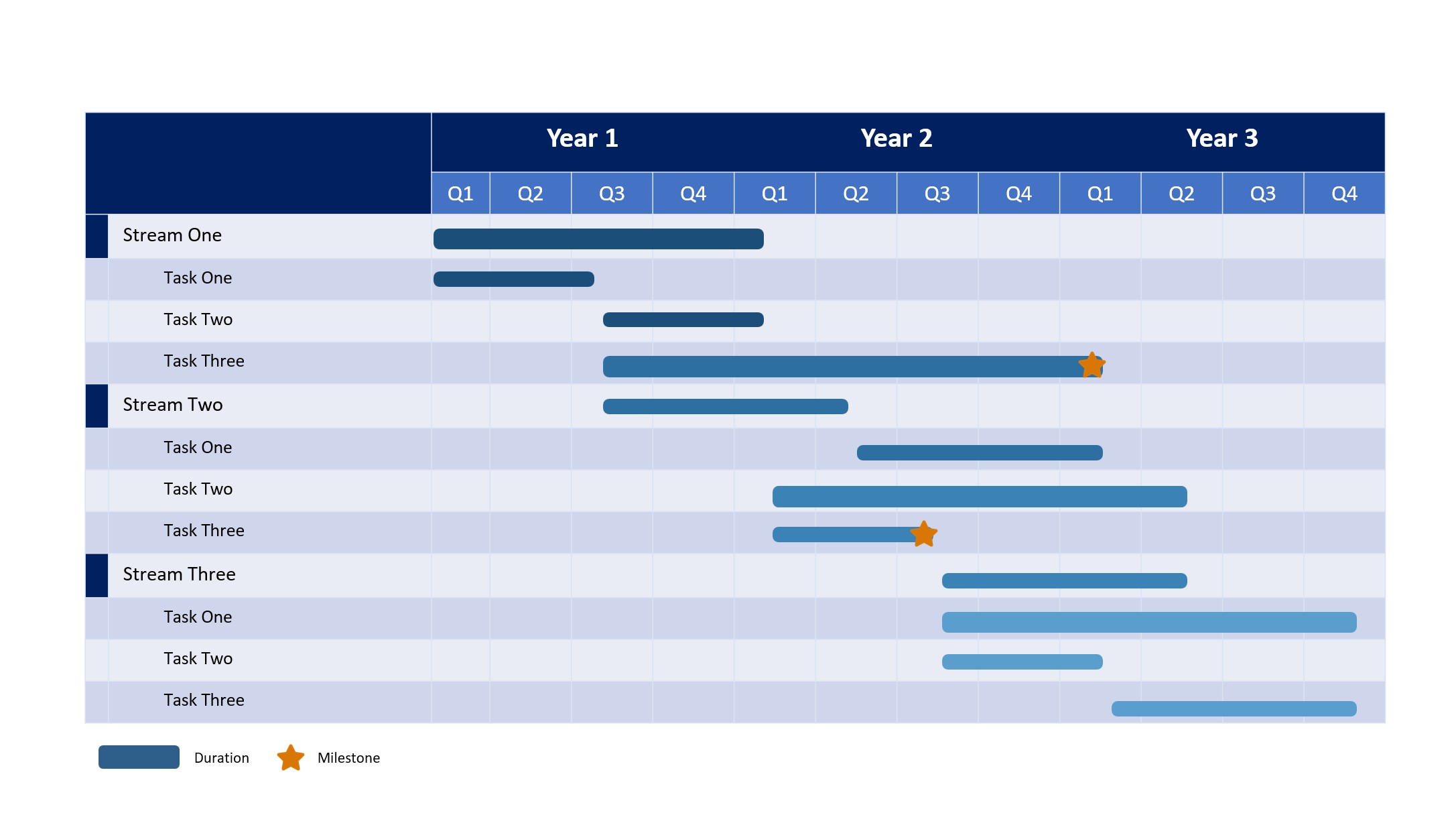
A Gantt chart (also called a project timeline, project schedule chart, or bar chart timeline) is a visual project management tool that displays tasks as horizontal bars on a timeline. Each bar represents a single task or activity, with the bar's position and length showing when the task starts, when it ends, and how long it takes. Tasks are typically listed vertically down the left side of the chart, and time intervals - days, weeks, or months - run horizontally across the top.
The intent of a Gantt chart is to provide a clear at-a-glance view of your entire project schedule. The Gantt chart should make it easy to immediately see which tasks are happening now, what is coming up next, and how tasks overlap or depend on each other. More sophisticated Gantt charts also show task dependencies (arrows linking one task to another), milestones (key project dates marked with a symbol), and progress indicators (shading or percentage-complete markers within each bar).
Quick history lesson: The chart is named after Henry Gantt, an American mechanical engineer and management consultant who popularized this format in the 1910s for industrial production scheduling. While the concept was independently developed by Polish engineer Karol Adamiecki a few years earlier (he called it a "harmonogram"), Gantt's version became widely known in the Western world and the name stuck. Today, Gantt charts are considered one of the most widely used project management tools worldwide.
Gantt charts are ideal for any project where you need to plan a sequence of tasks over time and communicate that schedule to a team or to stakeholders. They excel at answering the questions: What needs to be done? When? By whom? And in what order?
(Note - if you are looking to do a very high level project overview, we recommend that you instead refer to our blog post about Creating Timelines in PowerPoint)
Common usage situations where Gantt charts are the right tool would include:
Gantt charts are particularly valuable when you have task dependencies - situations where one task cannot start until another finishes. For example, in a website redesign project you cannot start frontend development until design mockups are approved. A Gantt chart makes these dependencies visible and helps you identify the critical path. The critical path refers to the sequence of dependent tasks that determines the minimum time to complete the project. Any delay on a critical path task delays the entire project.
Gantt charts are less useful for projects that are highly uncertain or exploratory, where the scope and sequence of tasks are still being discovered. In those kind of scenarios, more flexible planning tools like Kanban boards or simple task lists would work better (until the project structure becomes clearer).
Several other chart types can show project information, but each has different strengths. Here is how Gantt charts compare:
| Chart Type | What is it? | Best for | Shows task duration? | Shows dependencies? | Learning curve |
|---|---|---|---|---|---|
| Gantt chart | Scheduling tool | Project schedules & timelines | ✓ | ✓ (with arrows) | Low - intuitive |
| PERT chart | Tool used to schedule, organize, and map out tasks | Critical path analysis (could use as a step before the Gantt Chart) | ✗ | ✓ (network diagram) | High - requires training |
| Kanban board | Visual project management tool that uses cards and columns | Work-in-progress tracking | ✗ | ✗ | Low |
| Timeline / roadmap | High level project overview | High-level milestones | Approximate | ✗ | Low |
| Calendar view | Calendar | Day-to-day scheduling | ✓ | ✗ | Low |
The key advantage of a Gantt chart over a simple timeline or roadmap is that it shows precise task durations and overlaps. You can see exactly when multiple tasks are happening in parallel, how long each one takes, and where bottlenecks might occur. Compared to a PERT (Program Evaluation and Review Technique) network diagram, a Gantt chart is far easier for non-technical audiences to understand. You can put a Gantt chart in a PowerPoint presentation and most project stakeholders should grasp the schedule immediately without any training.
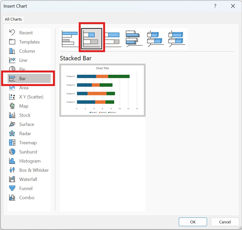
PowerPoint does not have a dedicated Gantt chart type in its Insert Chart gallery. However, you can create a functional Gantt chart using PowerPoint's Stacked Bar chart with some data structuring and formatting adjustments. This is the most accurate native PowerPoint approach because it produces a true timeline-based chart.
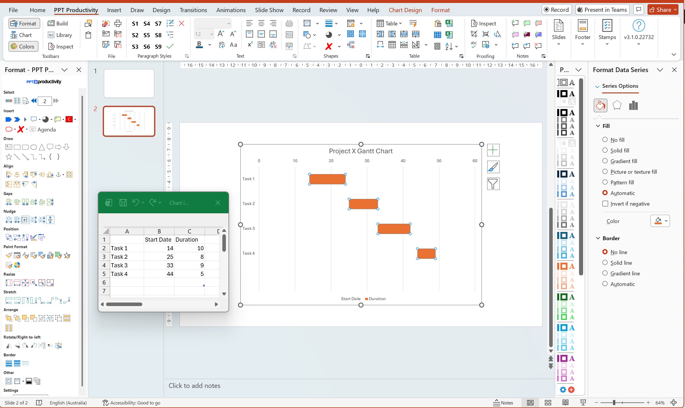
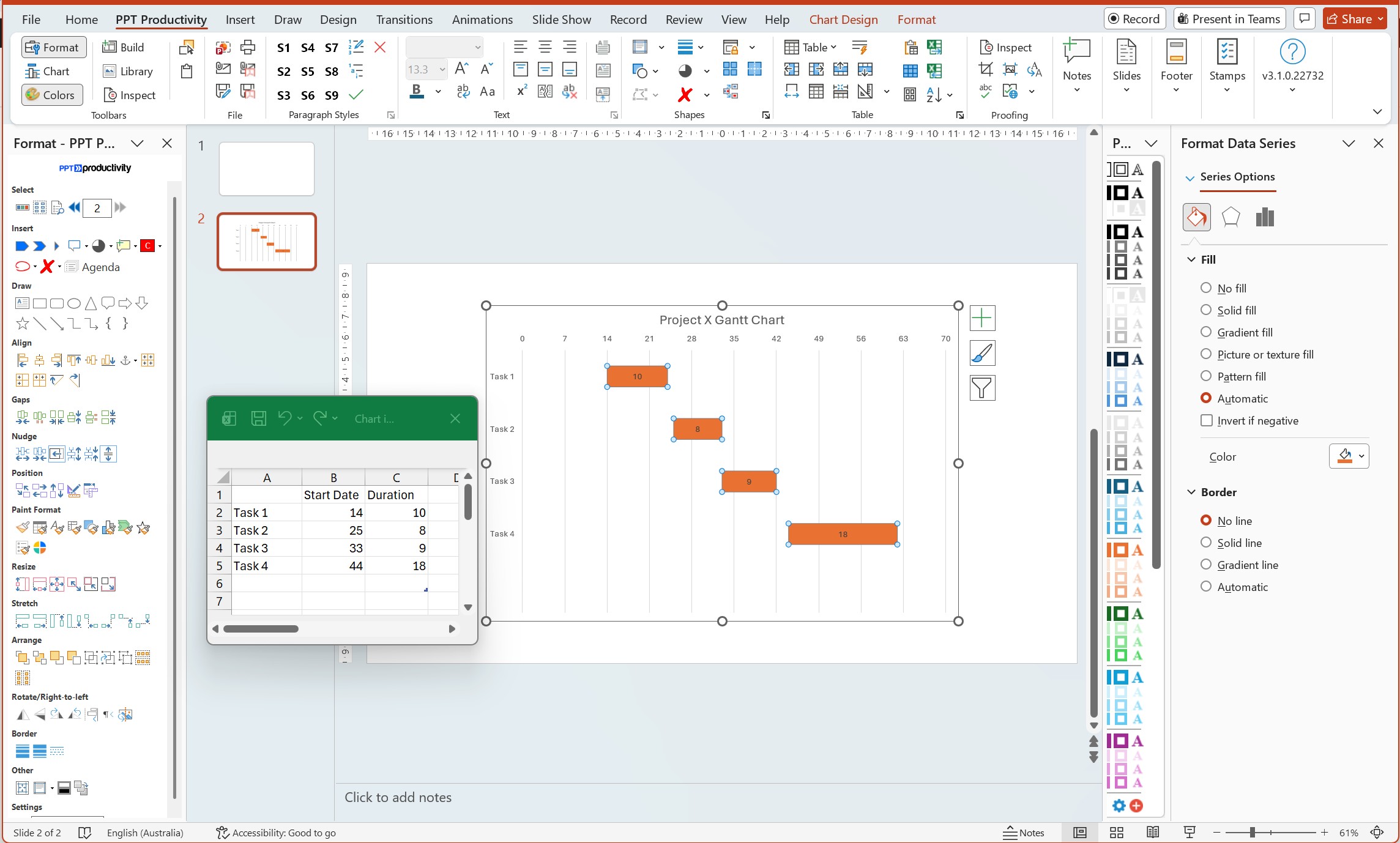
The technique uses two data series in a stacked bar chart: the first series represents each task's start date (how many days from the project start), and the second series represents the task duration. By making the first series (start date) invisible with No fill and No line, only the duration bars remain visible - positioned correctly on the timeline to show when each task starts and ends.
Step 1
Insert a Stacked Bar chart. To do this, go to the Insert tab on the PowerPoint ribbon and click Chart. In the Insert Chart dialog box, select Bar from the left-hand list, then choose Stacked Bar (note - not 100% Stacked Bar). Click OK and PowerPoint will insert a chart on your slide. PowerPoint will also open a linked Excel spreadsheet automatically.
Step 2
Set up your data in the Excel spreadsheet. In the Excel window, create three columns: Task names in column A, Start Date (in number of days from project start) in column B, and Duration (in days) in column C. For example, if your project starts January 1 and Task 1 starts on January 15 and lasts 10 days, enter: Task 1 | 14 | 10. The start date is 14 because there are 14 days between Jan 1 and Jan 15. Replace all placeholder data with your own task data.
Step 3
Make the start date series invisible. Click on any of the first bars in the chart (these represent the start dates). All bars in that series should be selected. Right-click and choose Format Data Series. In the Format Data Series pane on the right, under Fill select No fill. Under Border select No line. The first series disappears, leaving only the duration bars visible - now positioned correctly on the timeline.
Step 4
Reverse the task order, so the first task appears at the top. To do this, right-click on the vertical axis (the list of task names). Choose Format Axis, and check the box for Categories in reverse order. Your tasks should now appear with the first task at the top of the chart.
Step 5
Format the horizontal axis to show your project timeline. Right-click the horizontal axis (the numbers) and select Format Axis. Under Axis Options, adjust the Minimum value to 0 and the Maximum value to your total project duration in days. You can also change Major unit to set gridline intervals - for example, set it to 7 for weekly gridlines or 30 for monthly.
Step 6
Add data labels and clean up the chart. Right-click on the visible bars (the duration series) and select Add Data Labels. You can then right-click the labels and choose Format Data Labels to show the duration value inside each bar. Delete the legend if it only shows the hidden start date series. Remove gridlines or axis labels as needed to clean up the visual.
Step 7
Format bar colors and styles. Right-click the duration bars and select Format Data Series. Under Fill, choose Solid fill and select your desired color. You can also adjust the Gap Width slider to control spacing between task bars - a smaller gap width (closer to 0%) makes bars taller and easier to read.
Tip: If your project timeline uses actual calendar dates rather than "days since project start," you can use Excel's date serial numbers. Enter real dates in your Excel data (e.g., 1/15/2026), format those cells as dates, and Excel will convert them to numbers automatically. The start date for a task becomes the number of days between the project start date and the task start date.
Note: This method does not show task dependencies (arrows linking tasks) or milestones. For those features, please refer to Option 4 (add-ins) or Option 5 (import from dedicated project management software).
A simpler (though less precise) option is to create a Gantt chart using a PowerPoint table, with colored rectangles representing task bars. This approach gives you more control over the visual design but requires manual placement. It also does not automatically scale to real calendar dates.
Step 1
Insert a PowerPoint table. Go to Insert > Table and select Insert Table. Set the number of columns to match your timeline periods (e.g., 13 columns for 12 months plus 1 task name column), and set rows to the number of tasks plus a header row. Click OK.
Step 2
Set up the table structure. In the first row, label the first column "Task" and label the remaining columns with your time periods (Jan, Feb, Mar, etc. or Week 1, Week 2, etc.). In the first column of subsequent rows, list your task names.
Step 3
Add task bars by shading table cells. For each task, select the cells that correspond to when the task is active. Right-click and choose Table > Borders and Shading or use the Shading button on the Table Design tab to fill those cells with a color. The colored cells represent the task bar.
Step 4
Format the table for clarity. Adjust column widths so time period columns are equal width and the task name column is wider. Apply table borders to separate tasks. You can use different colors for different task types or phases. Make the header row bold or use a darker fill color to distinguish it.
Tip: Use Layout > Distribute Columns after selecting all your time period columns to make them exactly equal width - this ensures your timeline scale is consistent.
This table method is best for simple Gantt charts where you need a quick visual for a presentation and do not need precise date calculations. It works well for high-level project roadmaps showing major phases, rather than detailed task schedules.
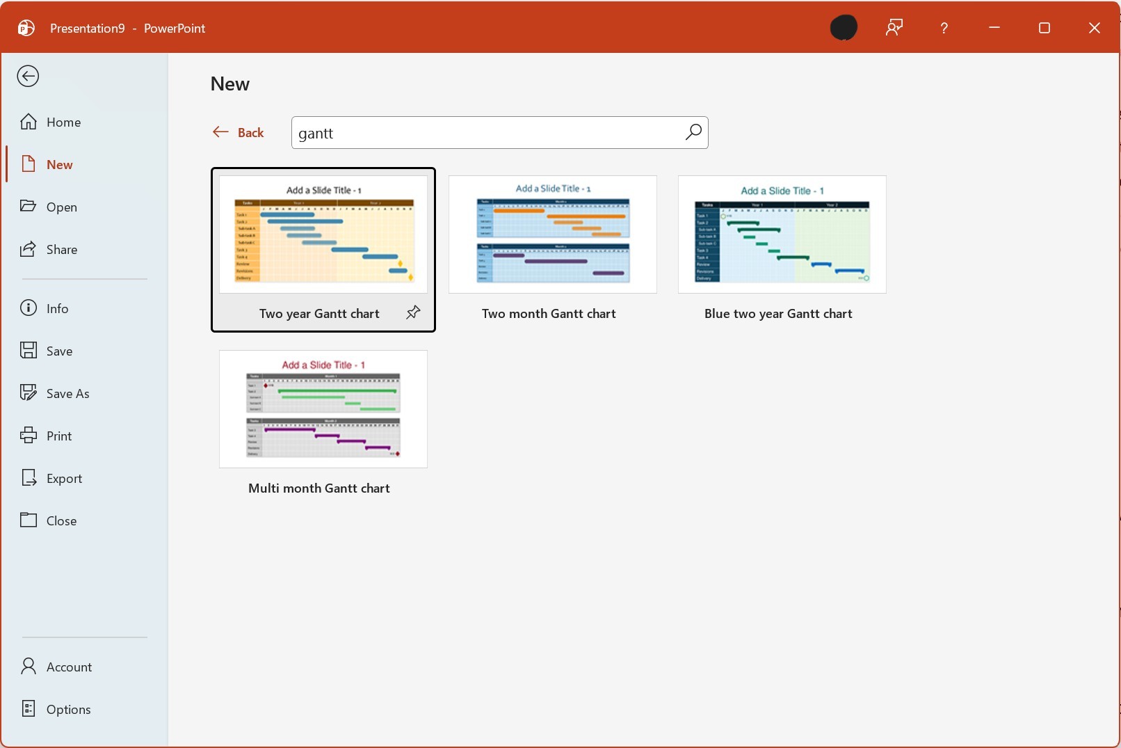
The fastest way to create a Gantt chart in PowerPoint (especially for a one-time use) is to download a pre-made template. Microsoft and third-party sources offer free PowerPoint Gantt chart templates that you can customize with your own data.
Step 1
Search for templates in PowerPoint. Open PowerPoint and go to File > New. In the search box, type "Gantt chart" and press Enter. PowerPoint will display built-in templates from Microsoft's library. Select a template that matches your project type (e.g. there are options for a simple timeline, multi-phase project, or detailed schedule).
Step 2
Download and open the template. Click the template thumbnail to preview it, then click Create. PowerPoint will download the template and open it as a new presentation.
Step 3
Customize the template with your data. Click on the text placeholders (task names, dates, durations) and replace them with your project information. Most templates use editable shapes or tables, so you can click directly on task bars to resize them or change their position. Update the timeline header to match your project start and end dates.
Step 4
Apply your branding and formatting. Change colors to match your company's brand palette. Update fonts if needed. Add or remove rows for tasks. Some templates include milestone markers (typically shown as diamond shapes) that you can reposition or delete as needed.
Tip: In addition to PowerPoint's built-in templates, free Gantt chart templates are available from Microsoft Office Templates (templates.office.com). Download templates in .pptx format for full editability. PPT Productivity add-in users can also use the Gantt Chart templates available in the PPT Productivity Slide Library.
Templates are ideal when you need a Gantt chart for a single presentation and do not need the chart to update automatically as project data changes. They offer professional visual design without the learning curve of creating a chart from scratch.
If you have already created a Gantt chart in Microsoft Excel, Microsoft Project, or dedicated project management software (Smartsheet, Monday.com, Asana, etc.), you can import it into PowerPoint for your presentation.
If you built a Gantt chart in Excel using the stacked bar method or a template: select the chart, press Ctrl+C to copy it, then switch to PowerPoint, click the slide where you want the chart, and press Ctrl+V to paste. For a linked chart that updates when Excel data changes, use Paste Special > Paste Link instead.
Microsoft Project creates native Gantt charts as its primary view. To export to PowerPoint: in Microsoft Project, use File > Save As and choose PDF or image format, or use the Copy Picture feature to copy the Gantt view to the clipboard. Paste into PowerPoint as an image.
Most cloud project management tools (Smartsheet, Monday, Asana, TeamGantt, etc.) offer export options. Common formats are PNG, PDF, or Excel. Export your Gantt chart, then insert it into PowerPoint via Insert > Pictures > This Device for an image, or follow the Excel import process if you export to Excel first.
Regardless of which method you use to create your Gantt chart in PowerPoint, following these formatting best practices will make it clearer and more professional:
Gantt charts are the go-to tool tor visualizing project schedules and timelines. They communicate complex scheduling information in a format that is understandable to both project teams and business stakeholders. While PowerPoint does not include a built-in Gantt chart type, you have multiple practical options: using a stacked bar chart with clever data structuring, creating a visual timeline with tables, downloading customizable templates, using dedicated PowerPoint add-ins, or importing Gantt charts from other tools.
As this post shows, there are a number of options for creating Gantt charts in PowerPoint. Whichever method you choose, following the formatting best practices - consistent colors, clear milestones, concise task names, and appropriate use of gridlines - will help to ensure that your Gantt chart effectively communicates your project timeline and keeps stakeholders informed.
Note that for teams looking to speed up their PowerPoint workflow more broadly, tools like PPT Productivity's alignment and formatting features can help you build professional slides faster across all your presentation needs in addition to the Gantt Chart templates in the Slide Library.

Start your 30 day free trial - Microsoft Office for Windows
Start Free Trial